.jpg)

.jpg)
Mood Board
The mood board for Texas Crude Brewing Company draws inspiration from Houston’s craft beer scene, featuring bold colors, playful typography, and energetic illustrations from brands like Karbach and Saint Arnold. These designs celebrate local culture with vibrant, eye-catching visuals.
Texas Crude’s design outcome reflects this energy while adding a distinctly Texan identity. With bold typography, industrial themes, and premium visuals, the designs connect with the target audience, blending Houston’s culture with a modern, polished look.
Case Study: Texas Crude
Project Overview
Texas Crude Brewing Company is a premium IPA-focused beer brand crafted for the Houston, Texas scene. Inspired by Houston's rich cultural identity and energy-driven economy, this brand combines bold flavors and striking visual aesthetics to appeal to young working professionals with refined tastes. The core lineup exclusively features IPAs with no unusual or eccentric flavors, maintaining a classic yet vibrant appeal for beer enthusiasts who value tradition with a modern twist.
Brand Logo
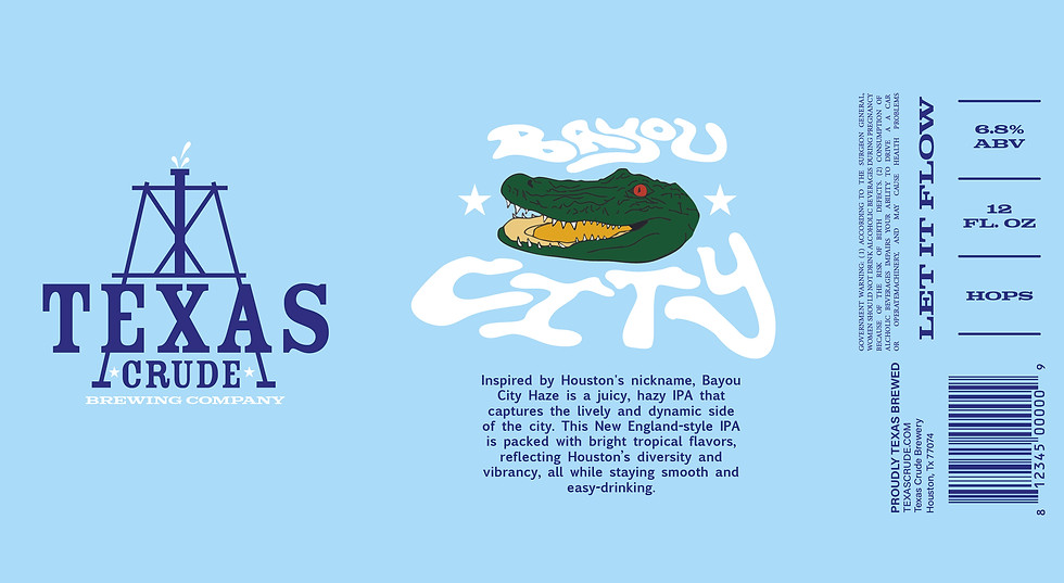
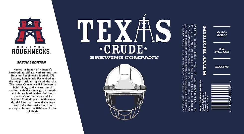
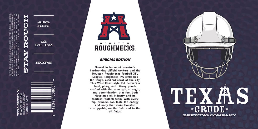
The Texas Crude Brewing Company logo is the cornerstone of the brand's identity. Inspired by Houston's deep connection to the energy industry and its rich cultural history, the logo combines bold typography with clean, contemporary lines. It’s a design that stands out on store shelves, immediately capturing the attention of craft beer enthusiasts. The logo embodies the rugged yet refined character of Texas Crude, setting the tone for a memorable and recognizable brand.
Visual Elements
Color Palette: The Texas Crude Brewing Company utilizes a bold and vibrant color palette, inspired by the energy of Houston’s nightlife and the iconic hues of oil rigs and industrial settings. Deep blacks and metallic tones evoke a rugged and premium feel, while pops of bright colors add energy and make the designs stand out on shelves.
Typography: Strong, industrial-inspired typography anchors the design, reflecting the boldness of Texas culture. Clean sans-serifs are paired with rugged, custom type treatments to strike a balance between modern sophistication and gritty charm, ensuring readability and a commanding presence.
Imagery: The imagery is centered around oil-inspired visuals, such as pipelines, gears, and abstract elements referencing Houston’s energy industry. These are paired with clean illustrations and dynamic layouts, creating a design that feels innovative while honoring local roots. This combination establishes a distinct visual identity that celebrates both tradition and modernity.


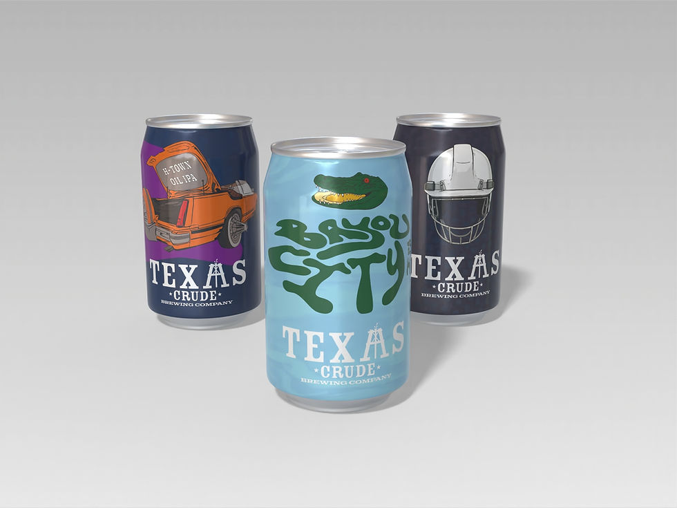
Final Digital Drafts


Mockups


Sketches


Design Objectives
Elevate Brand Identity: Create a clean and modern visual language that reflects the brand’s commitment to purity and simplicity, ensuring strong recognition across all marketing channels.
Enhance Shelf Presence: Design vibrant and minimal packaging that captures attention in a crowded market, leveraging bold typography and distinct color accents for flavor differentiation.
Connect with Target Audience: Develop an aesthetic that resonates with health-conscious, design-savvy consumers by combining sophistication with natural and refreshing elements.
1st Round of Digital Drafts