top of page
2nd Round of Digital Drafts

Sketches


Design Objectives
Elevate Brand Identity: Create a clean and modern visual language that reflects the brand’s commitment to purity and simplicity, ensuring strong recognition across all marketing channels.
Enhance Shelf Presence: Design vibrant and minimal packaging that captures attention in a crowded market, leveraging bold typography and distinct color accents for flavor differentiation.
Connect with Target Audience: Develop an aesthetic that resonates with health-conscious, design-savvy consumers by combining sophistication with natural and refreshing elements.
1st Round of Digital Drafts


Mood Board
The PURE Spiked Seltzer mood board conveys a harmonious blend of nature and minimalism, aligning with the brand's identity. Key elements include A soft and clean spectrum featuring whites and icy blues, complemented by bold accent hues for each flavor. Photos of fresh fruits, crisp water droplets, and snow-capped mountains to emphasize purity and refreshment.

Case Study: Pure Seltzer
Project Overview
Brand Logo
PURE Spiked Seltzer is a premium beverage brand offering naturally flavored spiked seltzers. The brand focuses on purity and simplicity, targeting health-conscious consumers who appreciate a refreshing, clean beverage with a modern and minimal aesthetic.
The design objective for PURE was to create a visually striking and cohesive brand identity that reflects the product’s natural and premium qualities while standing out in a crowded market. The deliverables included packaging design, brand logo, and supporting visual elements.

Visual Elements

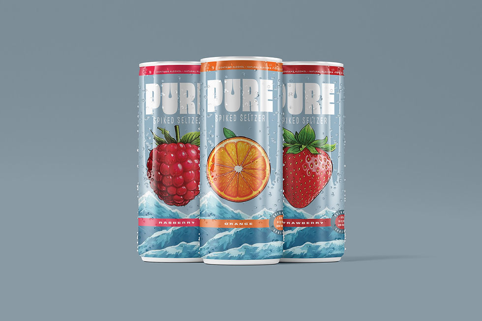
Color Palette: PURE's design features a harmonious combination of soft blues and whites, paired with vibrant accents like orange, pink, and red for flavor differentiation. These colors symbolize freshness and energy while maintaining a clean aesthetic.
Typography: The brand utilizes bold, modern typography with clean lines to convey simplicity and sophistication. The typeface ensures strong readability and reinforces PURE’s contemporary appeal.
Imagery: PURE incorporates natural visuals such as fruit slices and water droplets to evoke a sense of refreshment and purity. These elements seamlessly integrate into the packaging to enhance its overall appeal.


Final Digital Drafts


Mockups


bottom of page