top of page


2nd Round of Digital Drafts
3rd Round of Digital Drafts


Pattern
Sketches
Design Objectives
Eco-Friendly Aesthetic: The design should emphasize the brand's eco-conscious mission through earthy tones and natural shapes.
Versatility: The identity system should work across multiple platforms, including print, digital, and merchandise.
Approachability: Create a friendly, modern look that resonates with a broad audience of plant enthusiasts and sustainability advocates.


1st Round of Digital Drafts
Mood Board
My approach to designing for Eco Plant Shop focused on reflecting the warmth and vibrancy of the plant-loving community while emphasizing sustainability. Inspired by lush greens and the inviting, natural aesthetic seen in my mood board, I created a logo that embodies simplicity and eco-consciousness. The bold yet playful typography paired with organic shapes captures the shop's commitment to nature and growth. Each design element was thoughtfully chosen to resonate with plant enthusiasts and foster a sense of connection, aiming to position Eco Plant Shop as a haven for green thumbs and casual admirers alike.

Case Study: Brand Identity for eco Plant Shop
Project Overview
The Eco Plant Shop is an eco-friendly retail brand specializing in plants and sustainable living products. The goal of this project was to create a cohesive and engaging brand identity that reflects the brand's commitment to sustainability, simplicity, and community. Through thoughtful design, the brand identity needed to convey a sense of nature, modernity, and approachability to appeal to eco-conscious customers.
Brand Logo

The logo design combines an organic, rounded typeface with a graphic element representing a stylized plant. The central "e" is encircled by the shape of a fruit-like object with leaves, symbolizing growth and sustainability. This creates a modern yet natural aesthetic that effectively aligns with the brand's identity. The logo is versatile and works well across various mediums and color palettes, ensuring seamless application on packaging, digital platforms, and physical spaces.
Visual Elements
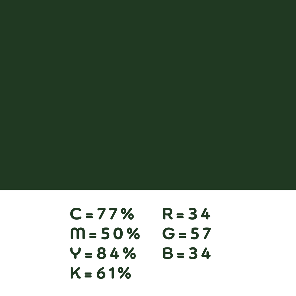
Color Palette
The primary colors used are earthy greens and muted natural tones, evoking a sense of calm and connection to nature. Accent colors include soft neutrals to balance the palette and create contrast.
Typography
A clean sans-serif typeface was selected for its readability and modern feel, complemented by a rounded, organic typeface for accents. This combination maintains professionalism while adding a playful, approachable quality.
Iconography
The stylized "e" in the logo doubles as an emblem for the brand and can be used independently in branding materials, enhancing flexibility in design applications.


Final Digital Designs
Primary Logo


Secondary Logo
Mockups
Exterior Branding
Interior Branding


Merchandise
bottom of page